About Online Ruler
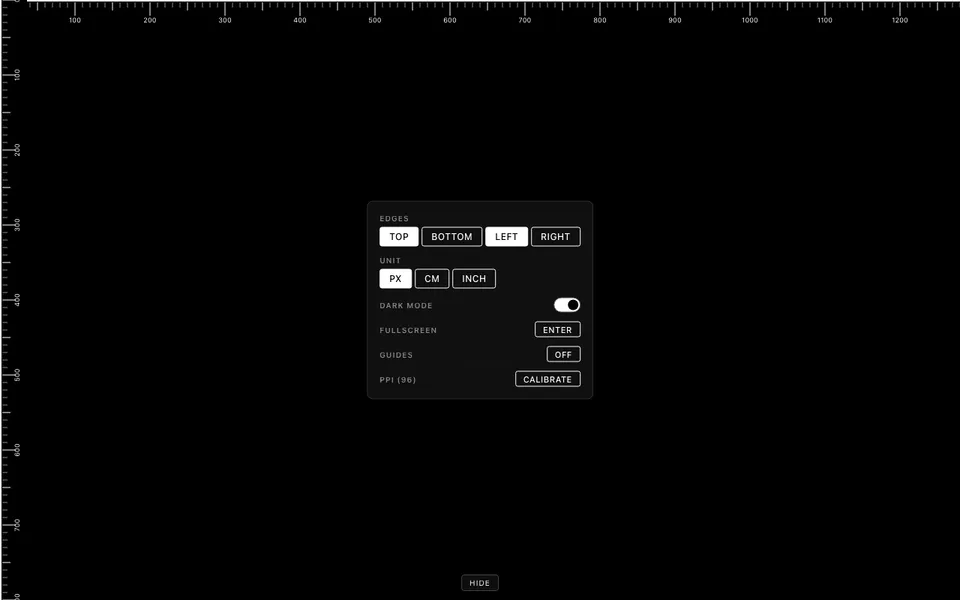
Online Ruler turns the edges of your screen into a ruler you can hold real objects against. It shows markings in centimeters, inches or pixels, and you can switch units at any time. Rulers can run along the top, bottom, left or right edge, in any combination, so you can measure across the display or down it. A browser has no way of knowing how large your screen physically is, so by default it assumes the CSS reference density of 96 pixels per inch. Most modern displays are denser than that, which is why the tool asks you to calibrate before you rely on a centimeter or inch reading.
There are three ways to do it: pick your phone, tablet, laptop or monitor from a built-in device list; enter the screen's diagonal size; or drag an on-screen card outline until it matches a standard bank card (85.6 × 54 mm). The card method needs nothing more than a card from your wallet, and it works for devices that are not on the list. Your calibration is saved in the browser, so you only need to do it once on each device. Crosshair guides follow the pointer, and clicking places markers that stay on screen until you press Escape. There are dark and light themes, nothing to install and no account to create.
What you can do
- Rulers in centimeters, inches and pixels, switchable at any time
- Three calibration methods, using a device list, the screen diagonal or a bank card
- Rulers on the top, bottom, left and right edges, in any combination
- Crosshair guides with click-to-place markers
- Dark and light themes, with calibration remembered in your browser
How to use it
- Open the ruler. It appears along the edges of the screen straight away.
- Calibrate once using the device list, your screen's diagonal, or a bank card held against the screen.
- Choose a unit and turn on the ruler edges you need.
- Line one end of the object up with the zero mark and read the length off the ticks.
- Turn on the crosshair guides to mark points; press Escape to clear the markers.
